RinkWorks Ad Contest
Dates
This contest ran from 10/3/05 to 10/31/05.
Prizes
The winner of the contest is awarded a free six-month subscription to
RinkWorks.
The first runner up is awarded a free three-month subscription to
RinkWorks.
The second runner up is awarded a free one-month subscription to
RinkWorks.
Note: To claim and make use of your prize, you must (1) supply a
valid email address, (2) sign up for a
Bitpass account (no money need be
deposited into it, so all you really need to do this is supply an email
address), and (3) have a system and browser supported by
Bitpass (see the relevant questions
on system requirements and supported browsers on Bitpass's
Buyer FAQ).
Note: To claim and make use of your prize, you must (1) supply a
Another Note: If you are already a RinkWorks subscriber,
you will be able to wait until your existing subscription runs out before
redeeming your free subscription.
Rules
- Contest Objective
-
Create an advertising image for RinkWorks or any of its individual
features. The objective of the content is to create the best one, in terms
of creativity, aesthetic appeal, and/or advertising value.
Entries, even those that do not win or place in the competition, may be used
on RinkWorks as part of advertising campaigns.
- Image Specifications
-
All advertising images must PNG or BMP files. JPG files are allowed for
non-text. GIF files are allowed for text or animated images. Additionally,
each image must be one of the following dimensions: 468x60, 728x90, 120x600,
160x600, or 300x250.
Feedback
This was a tough contest to judge, in part because of the strength of the
entries and in part because of the triple criteria: creativity, aesthetic
appeal, and advertising value. How do you rank three different entries, each
of which is strong in two of the categories and weak in one? Is a creative,
well-executed idea with slim potential as advertising better or worse than a
less entertaining image with stronger advertising qualities? There's no answer
for that, of course, but the rules of this contest force me to rank at least
the top three. I found myself making some surprising choices in certain cases,
going back on my first impressions in some cases.
Judging aside, my own goal in holding this contest was fulfilled in spades,
which was to obtain some fresh advertising images for the site. I don't have
an advertising budget, but I do like to spread RinkWorks ads around
the site for people that stumble upon an individual feature and don't think to
explore the rest of what RinkWorks has to offer. I'll be quite
happily using almost all of the entries (excluding only a couple of Ciaran's
for reasons too trifling to go into here) for advertising purposes.
So thank you very much, all who participated. Your contributions to the site
are greatly appreciated.
Results

|
By Djinn
Winner
For me, this one has it all: a great idea, beautiful execution,
and something I think will be compelling to people interested in
fantasy games. My only concern is that it could be too dark on certain
monitors, but I think it's evocative enough to draw the eye and entice
viewers to peer closer to make out the detail, which seems to be the
intent even on bright monitors.
|
|

|
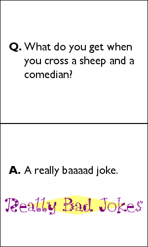
By Ciaran
First Runner Up
Ok, I admit it. I must be honest. I actually laughed at this joke.
This was a case where I had to figure out a way to lean toward one
criterion or another. This isn't as visually impressive as the other
finalists (although it's fine from an aesthetic standpoint), but it's
great as an ad: it evokes an immediate response from the viewer that
could very well translate into a click and does so simply by flawlessly
representing the content of Really Bad Jokes.
|
|

|
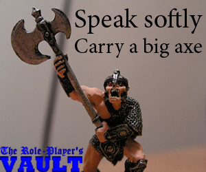
By Gahalyn and peroty
Second Runner Up
That is a big axe. Great image, great slogan. It should not be
surprising, I suppose, that the game features are covered by two of the
top three -- there's just so much room for imaginative imagery. My only
concern on this one is, are people going to know what The
Role-Player's Vault is by seeing this image? Is it an anthology of
games or an online store for fantasy figurines or role-playing accessories?
I don't know, but I think the target audience will be intrigued enough to
find out.
|
|

|
By Djinn
Honorable Mention
Beautiful. The art is a little uneasy in the image's dimensions, but what
a great idea and attractive execution.
|
|

|
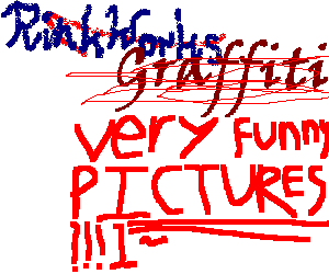
By Stephen
Honorable Mention
Quintessentially Stephen. Gotta love the drawing of the bag and the
fire in there.
|
|

|
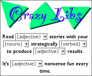
By Ciaran
Honorable Mention
Another instance where the content of a feature is accurately, succinctly,
and enticingly presented to the viewer.
|
|

|
By Ticia
Honorable Mention
Attractive and elegant.
|
|

|
By TalkingDog
Honorable Mention
It's possibly the only thing better than candy.
|
|

|
By Ciaran
|
|

|
By Ciaran
|
|

|
By Ciaran
|
|

|
By Ciaran
|
|

|
By Ciaran
|
|

|
By Ciaran
|
|

|
By Djinn
|
|

|
By Eric
|
|

|
By Estelendur
|
|

|
By Gahalyn and peroty
|
|

|
By Gahalyn and peroty
|
|

|
By Ticia
|
|
Back to the RinkWorks Contests page.

